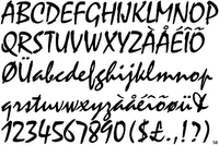
1950s typefaces
Typefaces making the rounds in the 1950s.
YAKOUT
DANTE
PALANTINO (ALDUS, MICHELANGELO, PHIDIAS GREEK, SISTINA)
BALLENTINES
TRANSPORT
UNIVERS (1952+)
DOM CASUAL (1952)
MELIOR (1952)
MISTRAL (1953)
FUTURA
Common usage of San serifs, Futura, Helvetica, Univers and moderns such as Bodini, Poster or ultra bodini, Crawmodern and Torino.
Craw modern:

Torino:

Transport:
http://www.celsius1414.com/transport_typeface

Dante:
http://www.fonts.com/FindFonts/HiddenGems/Dante.htm

Univers:

Dom Casual:

Mistral:

(images thanks to http://www.identifont.com/index.html)
There would be differences as in the 1950s typefaces were used in a different matter, not digital, no way, photocomposition devices were used. Very different visit http://www.redsun.com/type/abriefhistoryoftype/ or http://nwalsh.com/comp.fonts/FAQ/cf_28.htmfor more information on the different approach to type.
Some more elaborate fonts
http://www.fontscape.com/explore?7EG (fonts from the 50s)http://www.fontscape.com/explore?739 (fonts from the atomic age)http://www.fontscape.com/explore?7RU (font from just before the 50s but I'm sure Ive seen in 50s design).
YAKOUT
DANTE
PALANTINO (ALDUS, MICHELANGELO, PHIDIAS GREEK, SISTINA)
BALLENTINES
TRANSPORT
UNIVERS (1952+)
DOM CASUAL (1952)
MELIOR (1952)
MISTRAL (1953)
FUTURA
Common usage of San serifs, Futura, Helvetica, Univers and moderns such as Bodini, Poster or ultra bodini, Crawmodern and Torino.
Craw modern:

Torino:

Transport:
http://www.celsius1414.com/transport_typeface

Dante:
http://www.fonts.com/FindFonts/HiddenGems/Dante.htm

Univers:

Dom Casual:

Mistral:

(images thanks to http://www.identifont.com/index.html)
There would be differences as in the 1950s typefaces were used in a different matter, not digital, no way, photocomposition devices were used. Very different visit http://www.redsun.com/type/abriefhistoryoftype/ or http://nwalsh.com/comp.fonts/FAQ/cf_28.htmfor more information on the different approach to type.
Some more elaborate fonts
http://www.fontscape.com/explore?7EG (fonts from the 50s)http://www.fontscape.com/explore?739 (fonts from the atomic age)http://www.fontscape.com/explore?7RU (font from just before the 50s but I'm sure Ive seen in 50s design).


0 Comments:
Post a Comment
<< Home